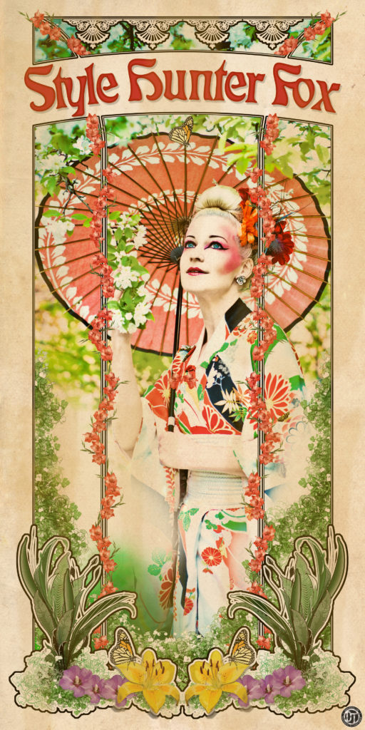
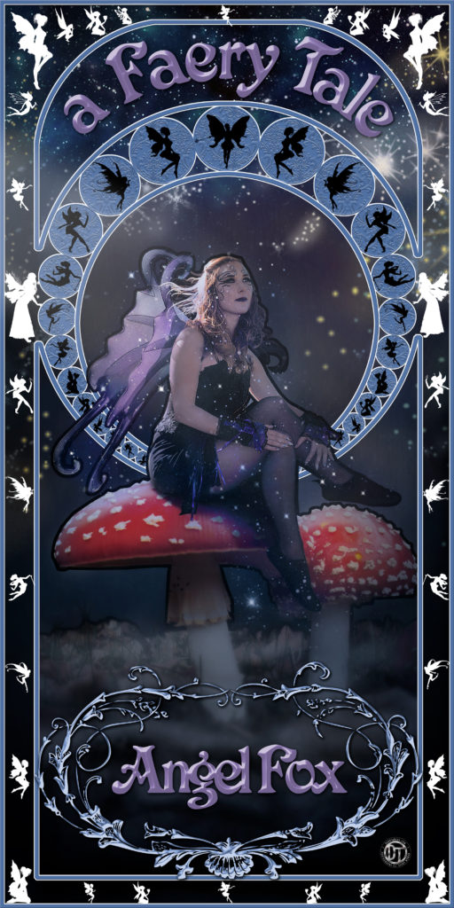
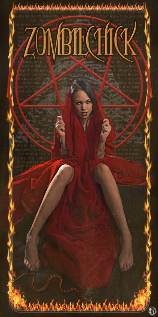
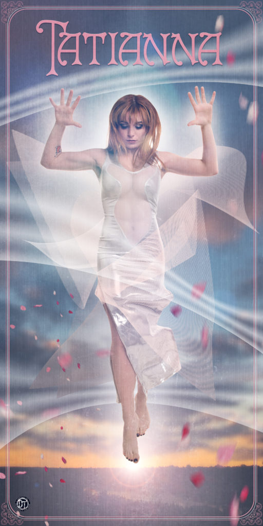
It’s been awhile since I’ve done a blog, but finally here it is. The inspiration for this entry is a mini project in the style of Art Nouveau! I had the realization that this design form is over 100 years old, and I wondered what that would look with today’s technology, using illustration and photo manipulation. After plenty of research, saving pins to Pinterest, and learning about the various style details, I decided to see what I could create in between my other photo projects. These images were created to be 19”x38” and look great in print! Thank you Joe-lynn Design Fine Art and Canvas Prints (facebook fanpage here)
First, I filtered through some of the many images that I already had to find one that would work with this style. A century ago, there was a new Japanese influence (actually termed, Japonism) in the West with the opening of Japan’s harbours for trade. Not only were goods and services exchanged…but also art. Artists such as Matisse, Van Goghs, Tissot, Renior, etc were influenced by the exposure of this new culture’s art and style. It made sense to use an image of our spring shoot that was in the Japanese theme. I had to use lots of nature, flowing lines, the right typeface for the period, tons of detail, making the photo look more like an illustration, plus the addition of texture and brush marks for the glue that would have been applied to an advertisement then. To me, this is the most accurate depiction of that style from the series. It was handy to reuse the illustrated flowers from my graphic design study with the Edmonton College of Art and Design – students keep those resources and always do nondestructive editing in Photoshop! Check Style Hunter Fox through her fanpage and Instagram.

For The Faery Tale – Angel Fox, I modernized the concept a bit by keeping the photo as a photo, not an illustration, keeping the image and style crisp. I enjoyed making all the details. The faery ring that surrounds her took quite a while but I found ways to speed up the processes. Although it’s a dark image, I think it still has a magical feel to it. The night sky, fairy dust, and lots of little faeries achieve that. Thanks so much Alison for a fun photoshoot last October and being a great friend! You can follow Angel Fox through Instagram.

Zombiechick – was a play to make something devilish…not as purely wholesome as the other pieces. It happened that I had a selection of slightly evil, but sexy images that I took at the beginning of the year with Alt model Zombiechick. It’s her style and I hope she likes it! Being a bit of a conspiracy enthusiast (I like hearing about the theories, I don’t necessarily believe in them), I added the Illuminati eye, and text written in Babylonian translated from English; David Bowie’s song “Blackstar”. Lots of details, but less of a “nature” theme than the typical style of art nouveau. I think it really works with the added wash and texture effects. Check out more From Zombie Chick through her Fanpage and Instagram accounts.

Tatianna is a stripped down version in its simplicity and the opposite in theme from Zombiechick. The photo was taken from a recent photoshoot, with Tatianna, whom I worked with for the first time. It’s always fun to take action photos of the model in motion, though tiring for her jumping so much! Watch for more of her photos on my Instagram and Facebook fanpage. For this image I added some very simple nature accents for the border. Blowing cherry blossom petals, and windbars seen in Japanese style tattoos. Though it doesn’t have the overflow of details that a lot of art nouveau typically has…I think the simplicity still reflects the style. Please follow Tatianna’s Instagram account!

I loved doing this mini project for myself! It’s great to take creative breaks, try and learn new techniques for improving my Photoshop workflow, and get back to my roots in graphic design using both Adobe Illustrator CS5 and Photoshop CC. Working as a photographer in Winnipeg, it can be bleak and freezing in the winter months…causing me to go outside even less than the rest of the year. This was a great distraction where it was necessary to take hours of research, plus trial and error for finding what works with the style. I’d love to make more images…and feedback from those who had seen sneak peeks, they felt these had a “tarot card” look, which makes sense. That gives me another avenue to potentially make more related images!
Let me know what you think of this set – and please connect to chat about your personal/business project or photoshoot!